
Assignment 10

all about mobile
Assignment 10 requested a Google Lighthouse audit of my main webpage when viewed through a mobile viewport.
I go into detail below the initial audit.

an overall score of 97!
It's no surprise my website scores high by default — I built it for the best viewing experience regardless of platform.
I went for a minimalist, clean approach that stays within narrow margins. It works pretty well on mobile. It's completely hand-written with no templates used, so it's pretty clear of any and all bloat.
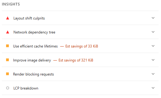
Of the things I could improve on, a couple of the images I use could be lower in resolution. As well, I need to make the padding on mobile just a little tighter for better accessibility.
There's also the fact that I use a separate, dedicated style sheet — Lighthouse would prefer everything contained to a single file. This improves fetch times.